Master color correction techniques for better listings
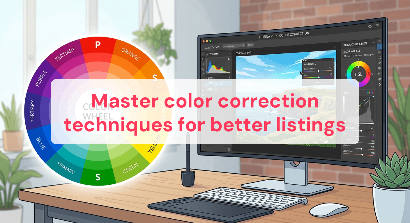
In real estate, images are king. A whopping 95% of home buyers check out photos before anything else in a listing. Yet, many rental property managers ignore the impact of color correction, which can turn a bland image into a captivating one that hooks potential guests. Bad color balance can make a room look unwelcoming, while proper tweaks can highlight its warmth and charm, making it feel like home before anyone even steps inside. This guide covers essential color correction techniques to upgrade your rental property photos from average to stunning, helping your listings shine in a crowded market.
Why color correction matters for rental listings
In rental listings, color correction can shape a potential guest's view of your property. How colors appear in your photos can either attract or repel viewers, making color correction a vital part of photo enhancement.
Impact on guest perception
First impressions in listings come from the images. A room that looks too dark or has uneven lighting can seem less inviting. Fixing these lighting issues creates a more welcoming and accurate picture of your space. For instance, if your room has beautiful natural light that's missing in your photos, adjusting the color balance can highlight this feature, making the space look brighter and more appealing.
Imagine your living room walls are a warm beige, but the photos show them as dull and gray. Enhancing the natural color captures its true essence, which can make a potential guest feel more connected and interested.
Influence on booking rates
Color correction affects more than just appearance; it impacts your bottom line. Research shows well-presented listings can boost booking rates by up to 20%. Photos with corrected colors look more professional and trustworthy. Guests are more likely to book a property that appears well-maintained and accurately depicted.
Benefits of proper color correction include:
- Improved visual appeal: Vibrant, true-to-life colors make your listing pop.
- Increased guest trust: Accurate photos build confidence in potential guests about what to expect.
- Enhanced perceived property value: Well-corrected images can make your property seem more luxurious and worth the asking price.
Focusing on color correction not only enhances your photos but also boosts your property's marketability and booking potential. For more on achieving these results, check out Real Estate Photography Techniques.
Understanding color balance: the foundation
Color balance is key to creating realistic images that accurately represent your rental property. It involves adjusting the intensity of colors in your photos, especially the balance of red, green, and blue, to ensure they appear natural. This is crucial in real estate photography, where the goal is to showcase the property as it is, without misleading potential guests.
Identifying color casts
A common issue in color balance is color casts. A color cast is an unwanted tint of a particular color, often due to lighting conditions. Photos taken under incandescent lighting might have a yellow tint, while those taken in shadows may appear bluish. Identifying these casts is the first step in correcting color balance.
- Blue Tint: Results from shooting in shaded areas or under overcast skies.
- Yellow Tint: Common in photos taken under indoor lighting or during sunset.
- Green Tint: Can occur in photos with fluorescent lighting.
Achieving natural tones
Once you spot the color cast, the next step is to correct it for natural tones. Here's how:
- Identify color cast: Look at the photo's overall color and determine if there's an unwanted tint.
- Use auto-correction: Most photo editing software offers an auto-correction feature that can adjust color balance automatically. It's a good starting point.
- Adjust manually if needed: If auto-correction doesn't cut it, manually adjust the temperature and tint sliders in your editing software. Increase warmth to counteract a blue cast and add a touch of magenta to neutralize a green tint.
Mastering color balance ensures your photos accurately represent your space, boosting trust and interest from potential guests. For more editing insights, explore How To Edit Real Estate Photos.

Techniques to enhance color vibrancy
Color vibrancy can greatly affect how inviting a rental space looks in photos. By enhancing color vibrancy without overdoing it, you create images that are both striking and realistic. Here's how to strike that balance.
Using saturation wisely
Saturation is powerful but needs careful handling to avoid making images look fake.
- Selective saturation: Instead of boosting overall saturation, focus on specific areas. For example, in a living room photo, enhance the vibrancy of a colorful rug without touching the neutral walls.
- Enhance key features: Highlight elements that naturally draw the eye, like green plants or a blue sky. This can make a room feel more lively and welcoming.
- Monitor skin tones: If your photos include people, be careful with skin tones. Over-saturation can lead to unnatural hues, detracting from the photo's authenticity.
Enhancing specific colors
Sometimes, boosting the vibrancy of individual colors can make a room pop without losing its natural feel.
- Accent colors: Identify colors that define the space's character, like the deep blue of a feature wall or the rustic red of a brick fireplace. Enhance these to add depth without overpowering the photo.
- Maintain realism: Subtle enhancements can make colors stand out, but they should always reflect reality. Keep adjustments within 10-20% of the original color intensity.
- Consider the whole image: A vibrant cushion shouldn't clash with muted furniture. Ensuring a cohesive look is essential for maintaining realism.
By using these techniques, you create inviting images that resonate with potential guests. For more detailed editing insights, visit Real Estate Photo Techniques.
The role of contrast in color correction
Adjusting contrast is a powerful way to improve the depth and clarity of your photos. It can transform a flat image into one that's vibrant and inviting. Proper contrast brings out details, making your rental listing more appealing to potential guests.
Balancing contrast for clarity
Adjusting contrast changes the difference between light and dark areas of your image. This can make details more visible and the overall image more engaging.
- Increase contrast to highlight details: Boosting contrast enhances the texture of surfaces like wood grain or fabric patterns, making the environment look more tangible and real.
- Check for loss of detail in shadows/highlights: Ensure increasing contrast doesn't lead to loss of detail. Shadows shouldn't become too dark, and highlights shouldn't be overly bright. Maintaining balance ensures image quality.
- Adjust contrast of individual colors if needed: Sometimes, specific colors need their contrast adjusted without affecting the entire image. Enhancing the contrast of a green plant, for example, can make it stand out against a neutral background.
Avoiding over-contrasting
While enhancing contrast can improve a photo, overdoing it can be harmful. Too much contrast can lead to harsh lines and unnatural appearances.
- Monitor for harsh transitions: If shadows and highlights become too extreme, the image may look unrealistic. Watch for these harsh transitions, which can distract from the overall appeal.
- Preserve a natural look: Aim for a balance that enhances the photo while preserving its natural feel. A contrast adjustment of 10-15% is often enough to add depth without distortion.
By managing contrast carefully, you ensure your photos are clear and captivating. For more real estate photo editing insights, consider exploring our Real Estate Image Editing Services.
Advanced tools and software for color correction
Ready to elevate your rental listing photos? Advanced software tools can make a big difference, giving you precise control over every aspect of your images and showcasing your property in the best light.
Choosing the right software
Picking the right software is crucial for effective color correction. Here's a look at three popular options:
- Adobe Lightroom: Known for its intuitive interface, Lightroom offers a range of sliders for adjusting exposure, contrast, and color balance. Its preset feature saves time by applying pre-defined settings to your images.
- Adobe Photoshop: Offers more advanced capabilities, including layer-based editing and masking tools. This allows for precise color grading and corrections, giving you flexibility to target specific areas of an image.
- Capture One: A favorite among professional photographers for its superior color grading tools. Its advanced color editor lets you fine-tune colors with pinpoint accuracy, ensuring your photos maintain their natural look.
Key features to explore
Each software comes with unique features for achieving professional-quality results:
- Sliders for precise adjustments: All three tools offer sliders for adjusting brightness, contrast, and saturation, letting you enhance your photo's vibrancy without over-saturating colors.
- Presets and filters: Lightroom's presets and Photoshop's filters give your photos a consistent look, crucial when showcasing multiple rooms or properties.
- Color grading tools: Capture One excels with its color grading panel, enabling you to adjust hues, saturation, and luminance selectively, ideal for highlighting specific elements like furniture or artwork.
Experimenting with these tools can greatly improve your rental listing photos, making them more attractive to potential guests. For a deeper dive into editing techniques, check out our Real Estate Photo Retouching page.
Comparison of popular color correction tools
Choosing the right software for color correction can significantly impact the quality of your rental listing photos. Each tool offers unique features and benefits, catering to different skill levels and preferences. Below is a comparison of popular color correction tools to help you make an informed decision.
| Software | Ease of Use | Features | Price |
|---|---|---|---|
| Lightroom | Beginner-friendly | Presets, easy adjustments | $9.99/month |
| Photoshop | Intermediate | Layer-based editing, masking tools | $20.99/month |
| Capture One | Professional | Advanced color editor, tethering | $24/month |
Lightroom is ideal for beginners with its intuitive interface and user-friendly presets. Photoshop offers more control for those comfortable with intermediate-level editing, thanks to its advanced layer and masking capabilities. Capture One suits professionals seeking precise color grading and tethering options, making it a favorite among seasoned photographers.
Common Questions
Can I correct colors on my phone?
Yes, you can correct colors on your phone using various mobile apps. Apps like Snapseed and VSCO offer basic color correction tools such as brightness, contrast, and saturation adjustments. While these apps are convenient for quick edits, they may not provide the same level of precision as desktop software. For best results, consider using your phone for minor tweaks and saving major edits for more advanced tools.
How do I avoid making colors look fake?
To prevent colors from appearing fake, focus on subtle adjustments. Start by ensuring the white balance is set correctly, as this sets the stage for natural-looking colors. Avoid overusing saturation and contrast sliders; instead, make gradual changes and continuously compare with the original image. If in doubt, refer to color references or real-life examples to maintain authenticity.
Do I need professional software for basic adjustments?
Professional software isn't necessary for basic adjustments. Many free or low-cost tools can handle tasks like adjusting exposure, correcting white balance, and tweaking saturation. Software such as GIMP or basic features in free mobile apps can suffice for simple edits. However, for more complex adjustments or batch processing, investing in professional software might be beneficial.
How often should I update my listing photos?
Updating your listing photos every 6-12 months is a good practice, especially if your property undergoes significant changes like renovations or redecorations. Regular updates keep your listing fresh and reflect the current state of the property. Additionally, consider seasonal updates to showcase your property in different lighting conditions and surroundings, enhancing its appeal to potential guests.
Mastering color correction techniques can significantly enhance the quality of your rental listing photos, making them more appealing to potential guests. By focusing on color balance, vibrancy, and contrast, you can create images that accurately reflect your property's ambiance. Regularly updating and refining your photo editing skills ensures that your listings remain fresh and engaging. Keep exploring different tools and techniques to continuously improve your visual presentation and attract more bookings.
Ready to have professional photos?
Our team transforms your existing rental photos into stunning, high-converting images that bring you more bookings. No photoshoot required. 100% refund guaranteed.
Improve My Photos →