What Is White Balance in Photography for Rental Listings
Ever taken a photo of a stunning, bright white room, only for it to look orange or even blue on your camera screen 😞 Yeah, that’s a classic white balance problem. I’ve been there more times than I can count.
At its core, white balance in photography is simply the process of telling your camera what "white" looks like under different kinds of light. Getting this right is the secret to making all the other colors in your photo look natural and true-to-life.
Your Brain vs. Your Camera's Sensor
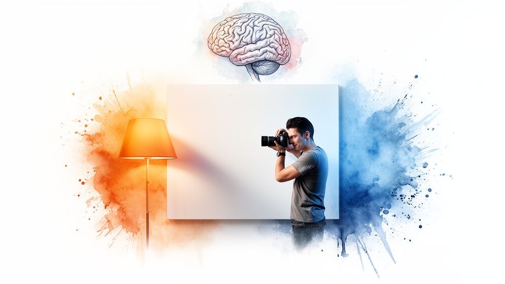
Here's a simple way to think about it. Your brain is incredibly smart. When you look at a white wall, it looks white to you, whether you're standing under the warm, yellow glow of an indoor lamp or next to a window with cool, blueish daylight pouring in. Your brain automatically adjusts and just knows what true white is supposed to be.
A camera sensor, on the other hand, isn't nearly as sophisticated. It just records what it sees. If the light in the room is warm and orangey, your photo is going to come out with an orange tint. That's why understanding white balance is a total game-changer, especially for your rental listing photos.
Understanding Color Temperature
To really get a grip on white balance, you need to know about color temperature. Don't worry, it has nothing to do with how hot or cold the room feels. It’s all about the color of the light itself, which we measure on the Kelvin (K) scale.
Think about the different kinds of light you see every day:
Candlelight gives off a very warm, orange glow (a low Kelvin value).
Direct midday sun produces a fairly neutral, white light (a medium Kelvin value).
An overcast sky casts a cool, bluish light (a high Kelvin value).
This scale isn't new; it's based on the work of physicist Max Planck way back in 1900. His foundational research on measuring light's color is still what photographers like us rely on today.
White balance is essentially teaching your camera how to see white correctly under different lighting conditions, just like your brain does automatically. Getting this right is the secret to creating photos that feel authentic and inviting.
By mastering this one simple concept, you can make sure your property photos are vibrant, welcoming, and professional. The right white balance can make all the difference, and it's something the team at https://rental.photos focuses on to make listings truly stand out.
How Poor White Balance Can Cost You Bookings
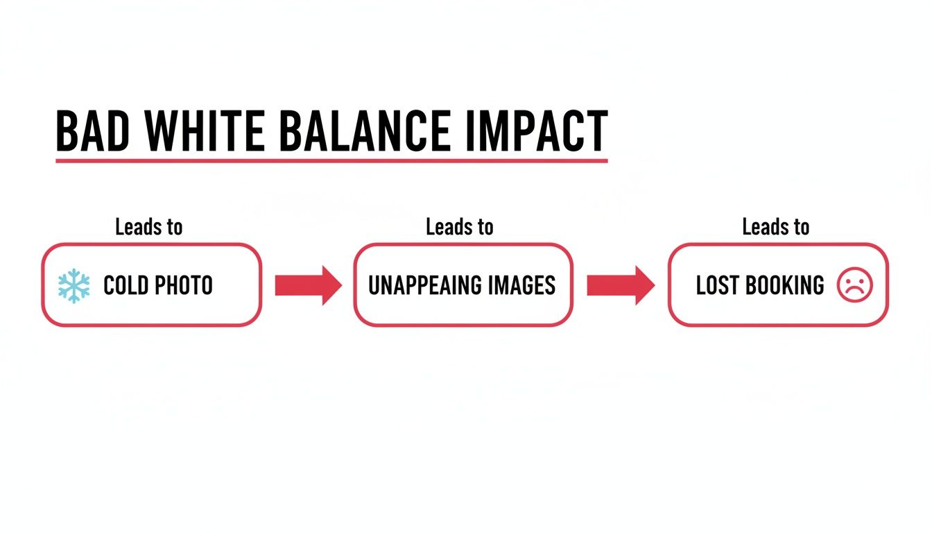
Let's be real... your listing photos are your digital storefront. They do the heavy lifting when it comes to selling your space. But when the colors are off, it does more than just look a little sloppy. It can actually make potential guests click away.
Getting the white balance wrong can have a serious, measurable impact on your booking rate. Think about the vibe you're trying to create. A subtle blue cast can make a warm, inviting bedroom feel cold and clinical. On the flip side, an overpowering orange tint can make a sparkling clean kitchen look dingy, dated, and just plain unappealing. It’s a tiny detail that makes a massive emotional difference.
First Impressions and Building Trust
Inaccurate colors immediately create a gap between what a guest expects and what your space is actually like. If that bright, airy living room in your photos is really painted a warm, creamy off-white, the difference can feel deceptive. It plants a little seed of doubt in a guest's mind, making them wonder what else might not be as advertised.
The goal is to present your rental honestly and attractively. Correct white balance helps you capture the true character of your space, giving guests the confidence they need to hit that 'Book Now' button.
Getting the color right isn't just about making pretty pictures. It’s about building trust from the very first impression. A photo gallery with consistent, true-to-life color shows guests you’re a professional host who cares about the details.
The Real Cost of "Good Enough" Photos
It might seem like a small thing, but these details add up fast. For Airbnb hosts, getting the white balance right in the camera is a game-changer. Research shows that nailing it on-site reduces color distortion by more than double compared to trying to rescue it later with editing software. This is why professionally enhanced photos from services like rental.photos, which rely on a human touch to perfect lighting and color, make interiors look so naturally inviting.
Great visuals build guest trust and can lead to a booking increase of up to 35%. You can learn more about how color balance impacts digital images and see the findings for yourself.
At the end of the day, poor white balance just sends the wrong message. It suggests a lack of care and can make a fantastic property look second-rate. By mastering this one simple aspect of photography, you let your photos do their job: selling the incredible experience you offer and securing more bookings.
Making Sense of Kelvin and Camera Settings
Alright, now that you know why white balance is so important, let's get into the practical stuff. Diving into your camera's settings might seem a little daunting, but I promise it's the fastest way to get photos that truly shine. This all comes down to understanding two things: the Kelvin scale and your camera's built-in presets.
What is the Kelvin Scale?
Think of the Kelvin (K) scale as a thermometer, but for the color of light. It’s just a simple way to measure how "warm" (orange) or "cool" (blue) a light source is, and it helps you tell your camera exactly what kind of light you're shooting in.
You don't need to be a scientist to get this. Just remember the basics:
Low Kelvin numbers, like 2000-3000K, mean the light is very warm and orangey. Think of a cozy fireplace or an old-school incandescent bulb.
High Kelvin numbers, around 7000-8000K, represent cool, blue-toned light. This is the kind of light you'd find on a heavily overcast day or in deep shade.
Bright, midday sun lands right in the middle at about 5500K, which is considered neutral. When you tell your camera the Kelvin value of the light in a room, you're giving it the blueprint it needs to make the colours true to life, so a white wall actually looks white.
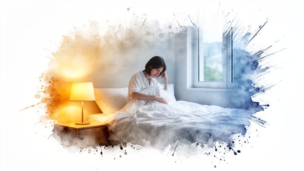
Getting this wrong isn't just a minor mistake; it can have a real impact on whether someone books your place.
As you can see, a photo with a cold, blue tint feels uninviting, which can stop a potential guest from clicking that "Book Now" button.
Common Light Sources and Their Kelvin Temperatures
To make this even easier, here’s a quick reference guide. You can use it to help match your camera's white balance setting to the actual lighting you're working with inside your rental.
| Light Source | Approximate Kelvin (K) | Visual Effect |
|---|---|---|
| Candlelight | 1800-2000K | Very warm, orange-red glow |
| Incandescent/Tungsten Bulb | 2700-3300K | Warm, yellowish light |
| Sunrise/Sunset | 3000-4000K | Golden, warm outdoor light |
| Fluorescent Lights | 4000-5000K | Cool, can have a greenish tint |
| Direct Midday Sun | 5000-5500K | Neutral, "true" white light |
| Overcast Day | 6500-7500K | Cool, distinctly blue light |
| Heavy Shade | 7500-9000K | Very cool, deep blue tones |
Having this cheat sheet handy can save you a ton of guesswork when you're on-site.
Your Camera's White Balance Presets
The good news is you rarely have to punch in Kelvin numbers by hand. Your camera comes equipped with handy presets, often shown as little icons, that act as one-click solutions for the most common lighting scenarios.
Simply moving away from the "Auto" white balance setting is probably the single most effective change you can make to improve your photos. Here’s a rundown of the presets you'll find on most cameras:
Tungsten/Incandescent (Lightbulb Icon): This is your go-to for shooting indoors under standard, warm-toned lightbulbs. It tells your camera to add blue tones to cancel out that orange glow, making everything look neutral and clean.
Fluorescent (Tube Light Icon): Perfect for areas with fluorescent tube lighting, like some kitchens or garages. This setting is designed to combat the cool, sometimes greenish cast these lights produce.
Daylight/Sunny (Sun Icon): Use this when you're shooting outside in bright, direct sunlight. It’s the default for capturing crisp, vibrant exteriors on a clear day.
Cloudy (Cloud Icon): The light on an overcast day is much cooler and bluer than direct sun. This preset adds a bit of warmth to your photos to make them feel more natural and inviting.
Shade (House with Shade Icon): Light in the shade is even cooler than on a cloudy day. This setting adds a significant amount of warmth to compensate, preventing your images from looking overly blue.
Think of these presets as a simple conversation with your camera. You're just telling it, "Hey, we're shooting under this kind of light right now," and it does the hard work of adjusting the colors for you.
By consciously choosing the right preset, you’re taking control back from the camera's guesswork. It’s your toolkit for capturing accurate, appealing colors every single time you press the shutter.
Getting White Balance Right in Your Rental
Alright, let's move from theory to practice. How do you actually apply this to get great photos of your rental? The single biggest hurdle you'll face is mixed lighting. This is that classic, tricky situation where warm indoor lamps are fighting with cool daylight pouring through a window. It’s a combination that can easily throw your camera's Auto White Balance (AWB) for a loop, leaving your photos with a weird, unnatural color cast.
Interestingly, photography has a long history of color biases, with early film chemistry often calibrated for certain skin tones. While today's digital AWB is light-years ahead, and gets it right about 90% of the time in straightforward lighting.. it still gets confused by complex scenes. Think of a warm tungsten lamp (3000K) clashing with the cool blue light from a window (5500K). This is precisely why manually managing your white balance is so important for creating those warm, inviting rental photos. If you're curious, you can read more about the history behind white balance and its evolution.
Taming Mixed Lighting Like a Pro
The easiest way to deal with competing light sources is to simplify the scene. Instead of trying to balance the chaos, just take control.
Pick one dominant light source and stick with it. If a room is blessed with gorgeous natural light, just turn off all the lamps and let the daylight do the work. This gives you a clean, consistent look that your camera will have no problem capturing accurately.
On the other hand, if you're shooting a cozy basement den in the evening, pull the curtains shut and let the warm glow of your lamps create the mood. By getting rid of the mix, you get rid of the problem.
Quick Tips for Better In-Camera Color
Here are a few things you can do to get better color right from the start, no editing required:
Shoot During the "Golden Hour": For your exterior shots or any rooms with big windows, try shooting just after sunrise or before sunset. This "golden hour" light is soft, warm, and incredibly flattering, and your camera’s AWB loves it.
Match Your Lightbulbs: If you can, swap out the bulbs in a room so they all have the same Kelvin temperature. This creates one consistent color of artificial light, making it much easier for your camera to process.
Shoot in RAW: If your camera has a RAW setting, use it! Think of a RAW file as a digital negative. It captures way more color information than a standard JPG, which gives you a ton of flexibility to perfect the white balance in editing without any loss in quality.
Here's a little creative tip I love: try setting your camera to the 'Shade' preset, even when you're indoors. It often adds a subtle, pleasant warmth that can make a space feel instantly cozier and more welcoming to a potential guest.
Master Your Color with a Gray Card
For anyone who wants total control and perfect accuracy, using a gray card to set a custom white balance is the gold standard. It might sound technical, but it’s actually quite simple.
You just place a special, neutral gray card in the room you're shooting, take a picture of it, and then use your camera's menu to tell it, "Hey, this color is true gray." From that point on, the camera uses that perfect reference to nail the white balance for every other photo you take in that same light.
This trick guarantees consistent, true-to-life color across all your images and can save you a ton of time trying to fix things later. Of course, if you'd rather leave it all to the experts, professional photo editing services can handle these technical details for you.
Easy Fixes for Photos You've Already Taken
So, you've uploaded your photos to your computer, and the colors just look… wrong. Don't panic! This happens to all of us, and the good news is that you can almost always fix it with a few simple clicks.
Even if you’re not a photo editing pro, you can easily get rid of those strange color casts. Most editing software, even the free apps on your phone or computer, has two surprisingly powerful tools: the temperature and tint sliders. Think of these as your main controls for neutralizing weird color problems.
Your Go-To Editing Tools
Using these sliders is incredibly intuitive. If your photo looks too blue and cold, just slide the temperature slider toward the warmer, yellow/orange side until things look right. If it’s too orange and warm, do the opposite and nudge it back toward blue. It’s that simple.
The tint slider works the same way, but it balances between green and magenta. This one is a lifesaver for correcting that weird greenish glow that fluorescent lights often cast on a room. A tiny adjustment here is usually all you need to make the colors snap back into place.
Pro Tip: Find something in your photo that you know should be a neutral color: a white wall, a gray countertop, or a black appliance. Keep your eye on that spot as you adjust the sliders. Once it looks truly neutral (not bluish, not yellowish), the rest of the colours in the photo will usually fall right into line.
Another amazing tool you'll find in most editing programs is the eyedropper. It’s basically a magic wand for color correction. You just click the eyedropper on a neutral gray or white area in your image, and the software instantly adjusts the white balance for you. This one-click fix often gets you 90% of the way there in a matter of seconds.
When to Bring in the Experts
While these quick fixes are incredibly useful, it's worth knowing that every camera brand sees color a little differently. For example, a Nikon flash has a white balance of around 5400K, but a Canon flash is closer to 6000K. That's a noticeable difference that can affect your starting point for edits.
Professional editors are experts at navigating these subtle variations. They fine-tune the color temperature with precision, warming up cool blues or cooling down harsh reds to achieve a perfectly natural and inviting look. As this image statistics report shows, those small professional adjustments can make a massive difference in the final quality.
For busy hosts, a dedicated photo editing service is a game-changer. Instead of spending your valuable time fiddling with sliders, you can hand off the technical work and get back consistently beautiful, professional images every single time. If you want to see how that works, you can learn more about our photo enhancement service for rental listings.
Your Top White Balance Questions, Answered
Once you start paying attention to white balance, a few common questions always seem to pop up. Let's tackle the ones I hear most often from hosts who are trying to get their listing photos just right.
Can I Just Use Auto White Balance?
Honestly, the Auto White Balance (AWB) on most modern cameras and smartphones is pretty impressive.. most of the time. If you’re snapping a simple outdoor shot with the sun as your only light source, AWB will probably nail it.
But interior photography is a different beast entirely. Your rental likely has "mixed lighting", you might have a warm lamp in one corner, cool daylight coming through the window, and a fluorescent bulb over the kitchen counter. This is where AWB gets overwhelmed. It tries to find a happy medium for all those different light sources and usually ends up with a strange, unnatural color tint.
So, while AWB can be a decent starting point, you can't rely on it for a whole set of listing photos. To get that consistent, professional look that builds trust with guests, you'll need to either take manual control or clean things up in post-processing.
Should My Rental Photos Be Warm or Cool?
Your first priority should always be to make your photos look natural, as if you’re standing right there in the room. That said, leaning ever-so-slightly toward a warmer tone almost always creates a more inviting feeling. You want guests to see your space as cozy and welcoming, not sterile and cold.
A photo with a cool, bluish cast can make even the plushest bedroom feel a bit chilly and uninviting. The trick is to enhance the room's natural vibe, not fight it. If you’re shooting a sun-drenched living room, let that bright, warm energy shine through in the photo. For a snug den with a fireplace, your photo should capture that intimate, cozy atmosphere.
The best rental photos feel true to the space, with just enough warmth to make a potential guest immediately imagine themselves relaxing there. Your white balance should support the story you're trying to tell about each room.
How Do I Make All My Photos Look Consistent?
Consistency is what separates an amateur photo gallery from a professional one. When every photo has the same color and brightness, it signals quality and helps a potential guest trust what they’re seeing.
The simplest way to attempt this on your own is to shoot all your photos on the same day, around the same time, to keep the natural light as similar as possible. But even that isn't foolproof, and it's not always practical.
The only truly reliable way to get perfect consistency across your entire photo set is through editing. This is exactly what a professional photo enhancement service is built for. When an expert edits your whole gallery, they ensure every single image, from the kitchen to the bathroom to the patio, shares the same clean, natural, and appealing color profile.
Do I Need an Expensive Camera for Good Color?
Not at all! The camera on your smartphone is an incredibly powerful tool, and it's more than capable of capturing fantastic photos for your listing.
What matters far more than the camera is your understanding of light and how to control the color settings. And here's the best part: even if you just point and shoot with your phone, most white balance problems can be easily fixed later on.
A good photo editor can take your smartphone shots and make them look like they were taken with high-end gear. It’s the final polish and attention to detail that make the biggest difference, not the price of your camera.
Ready to stop worrying about color casts and consistency? Let rental.photos handle the hard work. Our expert editors will enhance your photos to make your listing look its absolute best, helping you stand out and secure more bookings. Get professionally polished photos in under 24 hours. Learn more at rental.photos
Enhanced by Outrank app
Ready to have professional photos?
Our team transforms your existing rental photos into stunning, high-converting images that bring you more bookings. No photoshoot required. 100% refund guaranteed.
Improve My Photos →