Vacation rental color schemes that attract guests
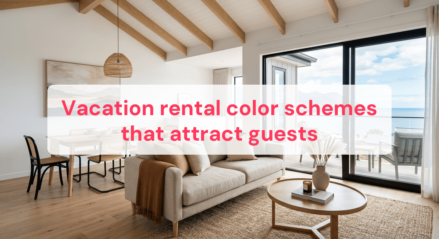
In the vacation rental game, standing out is everything. A whopping 62% of guests choose their bookings based on photos alone, so your property's visual appeal is crucial. Color isn't just decoration; it shapes mood and perception. Picture a rental with soothing blues that relax or lively yellows that energize. These subtle cues can make a guest's stay more comfortable and memorable. By grasping color psychology and using it wisely, you can turn your rental into a destination, not just a place to sleep. This guide will help you pick a color scheme that boosts your property's appeal and connects with your target market.
Why color matters in vacation rentals
Colors can make or break the guest experience in your vacation rental. They evoke emotions and set the mood, influencing how guests feel during their stay. By choosing the right color schemes, you create a welcoming environment that leaves a lasting impression.
Color psychology basics
Color psychology explores how hues affect behavior and emotions. Here's a quick rundown:
- Blue: Known for calmness and serenity, perfect for bedrooms or relaxation areas. It helps guests unwind.
- Yellow: Cheerful and energizing, ideal for kitchens or dining areas to create a lively vibe.
- Green: Represents nature and tranquility, bringing a refreshing feel to any room. Great for balance and rejuvenation.
- Red: Intense and stimulating, best used sparingly. It adds warmth and excitement but can be overwhelming in excess.
Applying color psychology to your rental
Consider how color choices affect guest experiences:
- Relaxation in the bedroom: Use soft blues or greens for a peaceful retreat. These colors promote better sleep and a refreshed wake-up.
- Vibrant common areas: Incorporate yellows or oranges in living rooms to encourage social interaction and joy.
- Focus in workspaces: For work areas, neutral tones like gray or beige boost concentration and minimize distractions.
Aligning color choices with each room's function creates a cohesive and emotionally supportive environment. This thoughtful approach makes your vacation rental more appealing and memorable. For more design ideas, check out these Vacation Rental Design Ideas.
Choosing the right color palette
Picking the right color palette for your vacation rental can greatly enhance the guest experience. By understanding the color wheel and complementary colors, you can create a visually appealing and harmonious space. A well-chosen palette not only attracts guests but also sets the right mood.
Understanding the color wheel
The color wheel is essential for creating cohesive palettes. It includes primary colors (red, blue, yellow), secondary colors (green, orange, purple), and tertiary colors (mixes of primary and secondary). Consider using complementary colors—opposites on the wheel like blue and orange—for vibrant contrast.
- Analogous colors: Next to each other on the wheel, they offer a subtle, soothing look. Blues and greens can evoke a calming seaside vibe.
- Triadic colors: Equally spaced around the wheel, they create a vibrant, balanced palette. Think red, yellow, and blue together.
Creating harmony with neutrals
Neutrals are the backbone of interior design. They provide a versatile backdrop for bolder colors without overwhelming the eye. Here's how to use them effectively:
- Balance bold hues: If your main color is bright yellow, use a neutral like beige or gray to tone it down.
- Layer textures: In a neutral palette, texture is key. Use materials like wood, linen, and metal for depth and interest.
- Highlight architectural features: White or cream can accentuate moldings or beams, making the structure itself a design feature.
A cohesive color palette isn't just about pretty colors—it's about creating a space that feels intentional and welcoming. For more decorating tips, explore our Vacation Rental Decor Tips.

Adapting color schemes to different spaces
Choosing the right color scheme for each room in your vacation rental can greatly influence guest comfort. Each space has unique needs and opportunities for creativity. Here's how to tailor colors to enhance different areas.
Living areas
The living room is often the first place guests gather, so it should feel welcoming and spacious. Colors are key:
- Light colors: Soft hues like pale blue or light gray make the room feel larger and more open, reflecting more light for an airy atmosphere.
- Accent walls: A bold color like navy or forest green on one wall adds depth and interest without overwhelming the space.
- Texture and contrast: Use textures in throw pillows or rugs with complementary colors for warmth and personality.
Bedrooms
Bedrooms should be a sanctuary for relaxation. The right colors can help achieve this:
- Calming tones: Soft blues and greens promote relaxation, mimicking nature for a tranquil feel.
- Warm neutrals: Beige or taupe create a cozy atmosphere. Pair with soft textiles for comfort.
- Personal touches: Add artwork or decor in muted tones for a personalized touch without disrupting serenity.
By adapting colors to each space, you create a harmonious and inviting environment for guests. For more on integrating color with trends, explore our Vacation Rental Design Trends.
Seasonal color considerations
Adapting your vacation rental's color scheme to the seasons keeps your space fresh and inviting year-round. Each season brings its own mood, and your color choices can reflect these changes beautifully.
Seasonal updates that wow
Changing colors with the seasons doesn't mean a complete redesign. Small updates can have a big impact:
- Summer vibes: Use bright and airy colors like turquoise, coral, and sunshine yellow for a beachy feel during warmer months.
- Winter warmth: Choose rich tones like burgundy, deep green, and warm ochre for a cozy retreat in colder weather.
- Spring renewal: Pastels like soft pink, mint green, and lavender signal spring's freshness, bringing renewal and optimism.
- Autumn coziness: Earthy tones like burnt orange, olive, and mustard reflect changing leaves for a warm, inviting atmosphere.
Easy color swaps
You don't need to repaint walls every season. Try these simple swaps:
- Textiles: Change throw pillows, blankets, and curtains to reflect seasonal colors quickly and affordably.
- Decor items: Swap vases, candles, and artwork with seasonal alternatives. Display seasonal flowers or foliage matching your palette.
- Area rugs: A new rug can redefine a space and change the mood instantly. Opt for lighter fabrics in summer, plush options in winter.
These small yet impactful changes keep your rental vibrant and current. For more inspiration, check out our Vacation Rental Lighting Tips.
Combining color with design trends
Integrating color schemes with the latest design trends can boost your vacation rental's appeal. Staying current with interior design trends keeps your property attractive and memorable for guests.
Trendy color combinations
Keep your rental appealing by embracing trendy color combinations. Popular trends like biophilic design, which brings nature indoors, use colors like deep greens, earthy browns, and soft blues. Pair these with natural materials like wood and stone for a calming atmosphere.
Other popular color trends include:
- Monochromatic schemes: Using shades of a single color creates a cohesive, elegant look. Try grays or beiges for a sophisticated vibe.
- Bold contrasts: Pair navy blue with crisp white or charcoal with mustard for a statement and contemporary edge.
- Pastel pairings: Soft pinks and light blues are back, offering a gentle, welcoming feel for a broad audience.
Incorporating design elements
To combine color with design trends, integrate key design elements. For a minimalist style, focus on a neutral color palette with pops of color in accessories like cushions or artwork. This keeps the space clean yet interesting.
- Accent walls: A bold-colored wall can be a focal point. Use deep teal or burnt orange to draw attention without overwhelming.
- Textured materials: Use materials with different textures to complement your color scheme. A velvet couch in emerald green adds richness and depth.
- Functional decor: Choose decor that serves a purpose, like colorful storage solutions or vibrant table lamps, blending functionality with style.
By combining these elements, your rental remains stylish and inviting. For more on design trends, visit our Vacation Rental Design Trends.
Quick guide to color schemes
Choosing the right color scheme can enhance your vacation rental's atmosphere. Different colors evoke emotions and serve specific functions. The table below compares popular color schemes, their emotional impacts, and where they work best.
| Color Scheme | Emotional Impact | Best Used In |
|---|---|---|
| Coastal Blues | Calming, Relaxed | Bedrooms, Living Rooms |
| Earthy Tones | Warm, Inviting | Kitchens, Dining Areas |
| Monochrome | Sophisticated, Modern | Living Rooms, Offices |
| Pastel Shades | Soft, Welcoming | Nurseries, Bedrooms |
| Bold Contrasts | Energetic, Dynamic | Entryways, Game Rooms |
Use this table as a quick reference to decide which color scheme suits different areas of your rental. For more on staging with these colors, explore our Vacation Rental Staging Secrets.
Common Questions
How do I choose colors for small spaces?
For small spaces, lighter shades make a room feel larger and more open. Soft pastels or neutral tones create an airy atmosphere. Mirrors and strategic lighting can further enhance the sense of space.
Can color really affect bookings?
Absolutely, a rental's color scheme can impact bookings. The International Journal of Hospitality Management found that well-thought-out color schemes can increase perceived value and attractiveness, potentially boosting occupancy rates. A cohesive color palette helps a listing stand out in a competitive market.
What's the best way to test a color scheme?
Test a color scheme with sample paints or swatches on a small wall section. Observe the colors at different times of day to see how they interact with natural light. Digital tools or apps can also help visualize color schemes before committing.
How do I balance personal taste with popular trends?
Balance personal taste with trends by incorporating current styles that complement your preferences. If you love bold colors but want to stay trendy, use them as accent walls or in decorative pieces. This keeps the space stylish yet personal, appealing to a wider range of guests.
Choosing the right color scheme for your vacation rental isn't just about aesthetics; it's about creating an inviting atmosphere that resonates with guests. By understanding the psychological impact of colors and adapting them to different spaces, you make your property more appealing and comfortable. Seasonal adjustments and balancing personal taste with design trends can enhance the guest experience, leading to better reviews and increased bookings.
Ready to have professional photos?
Our team transforms your existing rental photos into stunning, high-converting images that bring you more bookings. No photoshoot required. 100% refund guaranteed.
Improve My Photos →